
― For optimal viewing, please make your browser as wide as possible. ―
1.
Peter Turchi’s brilliant “Roads Not Taken”—one of sixteen booklets that make up Visual Editions’ Where You Are (2013)—is a meditation on all the hypothetical parallel versions of Turchi’s life that never materialized. On paper the piece reads like a smart personal essay, with some funky, overwrought formatting punctuated by chromatic street sign icons. At one point Turchi writes, “Ideally, The Map of Roads Not Taken would be four-dimensional, moving through time and space, with still pictures as well as audio and videos of what have happened alongside clips of what did.” Upon reading this description I began salivating at the narrative potential of such a map, but of course the power of the image relied upon the fact that such a map could never exist.
Except that the online version of “Roads Not Taken” is a formalistic nod to the infinite allure of this impossible map. The story is laid out on a limitless, scrolling window. The semi-contrived street sign icons suddenly take on an essential role in this context, for as we begin to scroll and scroll, we also begin to search for direction. I found myself wondering: Did Turchi actually write an infinite story? I couldn’t find the seams. The form of this story so perfectly matched the content, it brought the piece to an entirely new, metaphysical level. It is perhaps the most successful moment in all of Where You Are, on screen or in print.
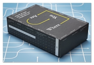
Indeed, what makes Where You Are so fascinating is its dual existence as a box containing sixteen physical booklets and a website, where-you-are.com, to which this content has been ported. While many print books have attempted a similar multi-platform extrapolation, Where You Are seems particularly suited for a dual paper/digital edition given some of the central themes of the project, which seeks to explore how we locate ourselves in a swiftly changing world and how these methods of location have evolved since the rich mnemonic stomping grounds of our childhood.
London-based Visual Editions—which previously brought us an intricate new edition of Laurence Sterne’s The Life and Opinions of Tristam Shandy, Gentleman as well as Tree of Codes, Jonathan Safran Foer’s palimpsestic die-cut reworking of The Street of Crocodiles—are clearly interested in exploring the boundaries of print technology, incorporating old book-making techniques with new visual aesthetics, and Where You Are’s twin existence feels a natural extension of this trajectory. The project features sixteen different writers, artists, and thinkers offering a range of interpretations on the ways in which we map our experience, both literally and metaphorically. We get contemporary art, musings about adolescent snogging spots and paper routes, diagrammatic explanations of GPS technology, cartograms of playgrounds or a homeless person’s urban trajectory, fictional maps depicting writer’s block and imagined planets. As with most collections, the work is a bit uneven—some of the pieces feel as if they were created for another purpose and then hastily retrofitted for Where You Are. Despite this, a number of the booklets—particularly those by Turchi, Geoff Dyer, and Will Wiles—feel essential as they cleverly scrutinize the borderlands of map, identity, and narrative.
But even more than the content of Where You Are, the cross-media transposition of this content seems ripe for analysis, particularly because a) this is increasingly the direction that print publishing is heading, and b) this transposition is rarely done well.
2.
In the brief history of online literary publishing, perhaps the first major blip on the screen was the fleeting, largely unsuccessful hypertext fiction craze of the mid-1990s. The promise of multimedia integration, stackable windows, non-linear architecture, and most importantly interactivity led proponents to make all kinds of wide-reaching decrees about the death of the author, the death of print, the death of publishing, or all of the above. Tellingly, none of this came to pass. Instead, it was hypertext fiction that died an inglorious death on the hard drives of so many Macintosh Performas. Its demise was due to a variety of reasons, including the clunkiness of those early hypertext interfaces, where clumsy HTML architecture got in the way of narrative pathos (see, for example, Mark Amerika’s Grammatron). But at its heart, hypertext fiction’s failure pointed at a fundamental lesson in storytelling—that when it comes to narrative, interactivity is not always a good thing. Readers want to be guided; they want space to breathe and explore the world at their own pace, but they ultimately want to feel like they are in the hands of the storyteller.
There was a second wave of interest in online-porting with the release of the first e-book readers about five years ago. Publishers—unsure of what this new landscape of electronic media would look like and nervous about the effects on their bottom line—ventured forth with caution. One of their early tactics was releasing “enhanced e-books,” which essentially meant taking the print book version and awkwardly tossing in a couple of video interviews with the author, maps of locations in the story, and other “bonus content,” à la DVD extras. Publishers wanted the edition to appear unique, with a perceived “added value” to entice readers to buy the e-book in addition to the print book. But as we have seen time and time again, when it comes to story, more is often not better. Narrative thrives off of omission, of what is not said, not shown, withheld. Simply loading an online version of a book with visual extras can often wreak all kinds of collateral damage on the careful architecture created by the author writing for an old-fashioned print book.
This seems to be the key point: up until very recently, most writers were writing exclusively for a certain technology—the printed page. Even writers producing content for today's online magazines have not vastly altered their idea of what the medium is: they assemble words together into a column of text which is then published, just as it would’ve been in a print magazine. It’s still a familiar delivery system—hey, if it ain’t broke, don’t fix it. Indeed, these first couple of generations of e-readers have done their darndest to emulate print books in many respects, sometimes laughingly so, as is the case with the skeumorphic animation of an iPad user turning a pretend page in the iBooks app. This facade of print impersonation shows no signs of abetting (see Amazon’s latest Kindle model, the Paperwhite) and no wonder: print books are a terrific, durable technology.
But web platforms offer a lot of features that paper platforms do not and not all of these features are simply gratuitous bells and whistles. It’s not enough for writers to write for the old paradigm of the print model and then for designers to clumsily try to adapt their stories to a web space. The content creator must create content with the medium specifically in mind so that the form of delivery embraces the substance of the story. If you are creating a story specifically for the web, then you must know what the web does well and harness this in your story space.
Indeed, the entire concept of “story space” requires a shift in perspective. Story space is the ecosystem where your story lives. In oral storytelling, this includes the actual room where the story is delivered, but also the timbre of the storyteller’s voice, her facial expressions, the rhythm of her delivery. With print books, the story space is composed of the physical qualities of the page, the texture and color of the paper, the size and shape of the margins, the syncopation of turning the pages, the manifest “thingness” of the book or magazine (or box of booklets).
On the web, this story space is vastly different. It is experienced on a glass, illuminated screen, in windows that scroll in all directions, which the user manipulates through a mouse or with his or her fingertips. Multiple windows can be present at once. Sound, image, video are all readily available to appear and disappear at a moment's notice. The user can interact with the text in a variety or ways through links, comments, live highlighting, drag-and-drop, etc.
In web publishing, the vast majority of these story space features are not utilized—and this is not necessarily a bad thing. Every news piece does not need a soundtrack, flash animation, or an interactive component. But this also does not mean online publishers should simply slip into complacency and recycle old tricks. Most web storytelling is delivered via online magazines that require a flexible template format that must accommodate a wide variety of pieces. By default, this template is usually a long column of text, usually on the left side of the page, with the right side reserved for links to popular articles, ads, and various related (and non-related) content. This model (of which I am using a version here) works okay; the layout is familiar to us and it successfully delivers words to the readers’ eyes. But it’s also terribly unimaginative and quite limiting if any other content beyond type is utilized.
One of the most elegant template platforms on the web right now is Triple Canopy’s Alongslide, which intuitively allows text and image to coexist “alongside” one another, often moving and shifting at different rates. Alongslide is Triple Canopy’s third version of their platform and the mindful evolution behind its design is evident: borders and margins are always preserved, conjuring that important white cushion of a paper page, but images are resized inside the window to utilize a full bleed. Navigation is horizontal rather than vertical, an interesting choice considering the directionality of the web has become so decidedly north-south. Yet such a choice does not so much feel like the skeumorphic mimicry of the iPad but rather a purposeful reorientation: our eyes move horizontally, so given the infinite directionality of a window, it makes sense that the overall direction of a story space should also be horizontal, even if within a story, a subsection or image gallery can still move vertically. It is choices like these which make Alongslide feel pointed yet flexible, devised yet intuitive.
Considered template platforms that embrace the DNA of the screen are important and will most certainly handle the bulk of online content but in some ways I am most interested in the custom-made, bespoken story spaces that are designed for a single work. I tried to create one such space in the iPad version of my first novel The Selected Works of T.S. Spivet. Along with web genius Jeff Rabb (now of Atavist), we were intent on creating a bounded world that utilized a boundless screen. We were always conscious of designing for a touchscreen and how that point of contact might enable a certain intimacy to develop between the reader and the text. The interface allowed for formal innovation. The reader could smoothly navigate through overlapping windows by flicking, stroking, resizing with two fingertips. We wanted the reader to feel the storyteller’s curation at work, but we also wanted to allow a certain freedom of exploration. It was one of the more difficult narrative experiments I’ve ever done and again, I think the project ultimately suffered because we were still porting a novel originally written for the page to the touchscreen.
For me, the gold standard of web storytelling remains the Goggles’ (Paul Shoebridge and Michael Simons of Adbusters fame) poignant, heartbreaking Welcome to Pine Point. A collaboration with the National Film Board of Canada, Pine Point is a self-described “interactive documentary” that explores memory, loss, place, and the fleeting evocations of mementos in our lives. The fabricated mining town of Pine Point, just south of the Great Slave Lake in Canada’s Northwest Territories existed for exactly one generation before it was destroyed, just long enough for its inhabitants to form memories that lasted a lifetime. Shoebridge and Simons expertly interweave music, immersive soundscapes, photographs, video, and animation around and across a relatively minimal textual story line. (Lesson: In true web-designed stories, text should be the through-line but not the dominant media.) Pine Point utilizes an interactive environment which the reader can click through, although unlike other interactive pieces I’ve seen, it manages to perfectly balance the rhythm of interaction against the unfolding of the story. The user has just enough to do to propel himself forward, but never too much. In a way, the platform resembles the memories themselves, as it is composed of disparate, almost haphazard elements—a lost hat, a forgotten photograph, old VHS footage of a figure skater spinning in circles, an unexpected song that comes on the jukebox—but the sum of these signifiers is always greater than the whole. And the interactive element of the platform makes the user complicit in such recall—by navigating through this material, he begins to create his own memories about Pine Point even if (read: because) he has never been there. It’s invented nostalgia, and it arises directly from the open architecture of the platform.
3.
The online story space for Where You Are falls somewhere between the template and the bespoken, and this is part of its predicament. To be sure, the opening navigation page of where-you-are.com is charming and immediately forces us to consider how we visualize narrative. In this case, we see all sixteen pieces as outlined columns, with images and text represented by lines and boxes. We’re asked to click and drag around this splash page, which is larger than our window—again the architecture of the medium is highlighted and we’re forced to engage and interact with an overview of the project in ways we did not in the print version. We also see a roll call of links beneath each story. These, I assume, purport to enumerate the mentions of the projects in various online outlets, although when you click on each link it takes you to the main page of the site instead of the mention itself. This seems like inexact wayfaring, like placing a call to a friend in Detroit and instead getting Detroit directory assistance.
Occasionally yellow boxes will scroll down the columns of outlined text. I suppose these are meant to represent your online brethren simultaneously browsing the project. Whether real or not, the mapping of my ghostly co-readers put me on edge—in a good way. I also noticed that users’ URL addresses would occasionally pop up on the side of the window: “38.94.108.2 from Seoul viewed their 6th page.” I found myself impulsively clicking on these little notices, as if I could gain access to these other readers, peer into their living spaces. This voyeuristic feedback loop attached to the reading experience struck me as revolutionary and unique to the story space of the web. When my own url address appeared I felt exposed. Who was watching me? We are no longer just reading stories in our private rooms. The rooms are now virtual, and they are all connected to one another. The internet offers a communal interface in which we can separately coexist and simultaneously comment upon the loneliness of this coexistence.
Most of the pieces in Where You Are had been ported into the same very designed, very specific template, with a couple of notable exceptions. Unfortunately, I found this template incredibly irritating. The template itself is aesthetically beautiful, but it also a classic example of over-design, of form not listening to content—or, more specifically, not listening to the way we read. The screen has a familiar column of text on the left, while the right side of the window is reserved for media, most often a map. Fair enough. But someone coded the column of text to be semitranslucent until it scrolls almost to the very top of the page, just beneath the address bar. This certainly draws attention to the columnar format, the way we read, the geography of a window, the locality of attention . . . but it is also really fucking annoying and ignores neurocognitive research about the mechanics of deep reading, in which we don’t read locally but rather take in content in sections. Truthfully, this feature almost made me quit then and there. I felt as if I was being instructed exactly what to look at in any given moment, as though there were a finger pointing to the text, telling me this then that then this. Such didacticism struck me as very antithetical to the overall ethos of the project, which rests upon the flexibility of maps—maps which contain no starting or ending point and simply ask us to explore their territory as we see fit.
Beyond my quibbles with translucency, this template worked better for certain pieces than others. It was fascinating to see which design triumphed in print versus on the screen. For instance, one of my favorite pieces in paper form was Geoff Dyer’s “The Boy Out of Cheltenham,” which featured a printout of a Google Map of his hometown overlaid with icons that denoted various categories of experience: sex, drugs, employment, death. It was like a Choose Your Own Adventure book in that you could travel back and forth between narrative and place, reconstructing your own version of Dyer’s childhood. It was also a brilliant frisson of modern day technology (the populist accessibility of the Google Map) with deeply nostalgic, analog moments:

One would think that such a booklet would thrive in its online form. In this context you can utilize the actual Google Map—you can zoom in right down to the street or click on each icon and instantly have the column of text jump to this event. And yet I found the online template limiting. For one, it lacked the all-important key that you found in the paper version, an essential tool in constructing your own ersatz Dyer bildungsroman. You were also stuck scrolling and scrolling and scrolling. Yes, you could jump from number to number, but I wanted to be able to quickly leaf in and across events, the type of access enabled only by the old-fashioned page. Plus there was something touching in the print version about having to awkwardly unfold and refold the paper map, as if I were a tourist struggling with one of those old guide books. You only truly know a map when you have to figure out how the heck to refold it. The touching is important. In a way, the online version of “Cheltenham” was too clean. It lacked the sensuality of its subject matter.
In contrast, certain booklets excelled on the screen in what was otherwise a dull presentation in booklet form. Leanne Shapton’s “Tablescapes,” composed of still lifes of objects on her desk, felt encumbered in their print pamphlet. I didn’t understand what I was looking at. On the screen, they are smaller, in a long, scrolling column with much more white space, and most importantly, they have an inventory of objects alongside the abstraction of the visual, creating the proper dislocating effect of mapping the unmappable.
Perhaps my favorite piece within Where You Are is Will Wiles's “My Atlases,” in which Mr. Wiles lovingly recounts the time he spent scrutinizing hand drawn atlases, both as a child and an adult. These atlases, including the exquisite Nelson Universal Hand-Atlas (1925), exclude as much as they include, and much of what they include leaves Mr. Wiles with a beguiling set of questions. Why, for instance, does the city of Shanghai also have a separate “Chinese town” labeled?
Writes Wiles: “An underlying mystery, only obvious in retrospect, is what exactly was holding my attention to these little monochrome maps. They are not at all evocative of place [but] . . . this semi-blankness did make the maps cue for the imagination—I could, and did fill in my own buildings . . . free-writing cities in a stream of urban consciousness.” This remarkable little essay is beautifully presented in booklet form with the maps of Nelson Universal Hand-Atlas providing the marginalia around the text. Marginal space is critical space in books—it is where the physical act of the type is buffered from the literal space of the real world, the demilitarized zone where the reader’s imagination comes in contact with the tinder of narrative. And so this is a genius transposition, to have the maps provide this lush launching ground. The size of the booklet feels particularly right for this piece, since Wiles describes the Nelson Atlas “as comfortably hand-sized,” allowing for an intimate type of convocation. He even included pictures of himself holding the atlas. The hand itself is as important as what it holds.
I was worried about how this would translate to the screen. Just as Wiles had formed a relationship with the tactile nature of the Nelson Atlas, so too had I formed a bond with the physical manifestation of his remembrance. But I was heartened. The online version of “My Atlases” is different, to be sure, and some intimacy is lost in translation. But this is how it should be. As when a book is adapted into a movie, we should not seek to mimic exactly what is on the page but rather mine the soil beneath the story and let the new medium grow its own flora.
The web iteration of “My Atlases” is made up of a scrolling column but here the scroll feels like an act of discovery and the Nelson city maps are like cairns along your journey. And there is an added surprise: as you scroll through each map, the old hand-drawn Shanghai or Melbourne is replaced by a Google Map version of the city, like a curtain rising on a stage. Brilliant! Then and now, peeling forward time. I found myself performing this geographic-temporal transformation again and again, contemplating all that we have lost but also all that we have gained. I think I still prefer the paper version of “My Atlases,” as it is something I can hold and fold, but the print story space has gained new dimensionality now that I have also experienced its electronic sibling.
The optimist in me hopes that more projects like Where You Are will continue to appear, projects that celebrate and push the boundaries of what is possible in both media. The dialogue between paper and screen feels vitally important at this moment in time, particularly as our culture increasingly tilts toward online (and largely unconsidered) story space. It is an opportunity to learn from the lessons that print has taught us but then to also take this wisdom and apply it to new, exciting modes of storytelling. Considering print books have been around for over five hundred years, online publishing is still in its infancy. Much of the map remains blank.


The screen as an infinite landscape of possibilities. (click)

↑ In print Where You Are Online ↓

Early hypertext fiction: Adam's Bookstore by Adam Wegner.

Turning an invented page on the iPad.


Left-centric columnar layout of a typical web page.


The subtle parallax of Alongslide.


Tugging at the margins: the iPad version of Spivet.


Welcome to a masterclass in digital storytelling.

The inter-web at work: catalogued links ↑ & ghost readers ↓.


The column fades. (click)


The key is key.


I am holding Wiles holding Nelson’s Atlas.

Maps as marginal possibilities.


A Frankenstein Melbourne—half digital, half analog.
Reif Larsen is the author of The Selected Works of T.S. Spivet (2009) and the forthcoming I Am Radar (2015).